Evaluating Designs
In creating visual designs,it is really important to use different principles in order to make your output become outstanding or eye catching.Visual designs are important in advertising,giving information, or if you just want to share something memorable that you want to see in public.Here are some examples of visual designs with given evaluations.
1. Website Design
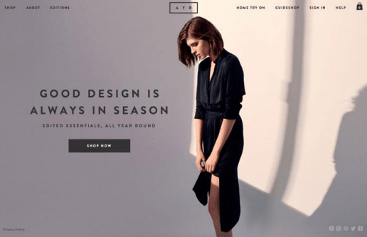
This type of website design is very attractive and elegant.It looks simple but there are lots of principles used in this visual design.The owner of the website used ccontrast, because the dark colors looks more appealing because it is placed in a lighter background.He also used proximity in his quote.Balance is applied in the web menus.Emphasis is applied to the woman because the dress is wearing is the main focus of the website,which is shopping.Shadows is applied to make the image more realistic and eye catchy.Over all, this is a good type of visual design.
2. Infographic
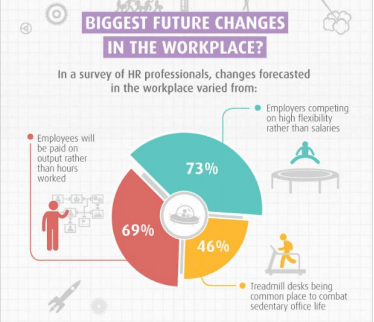
This type of infographic is simple but eye catching.Here, you will see that the percentage is emphasized. White space is used to make pie chart centered and noticable since it is light colored. Proximity is used in the main totle of the infographic.Allignment is used in the icons surrounding the pie chart because the text and the image shows unity.Contrast is applied in the numbers inside the slices of the pie chart. Shadow icon are also applied in the background to make the backround look less plain and boring.You can see that there is really creativity used in this infographic.Over all,this a good visual design.
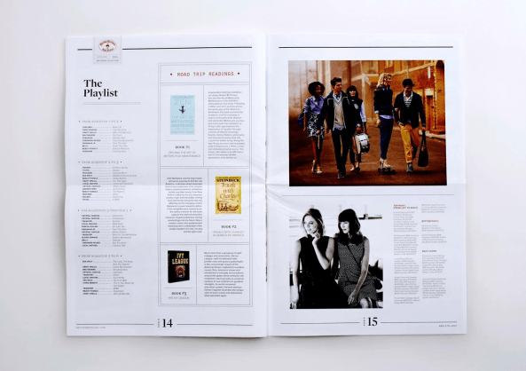
3.Magazine
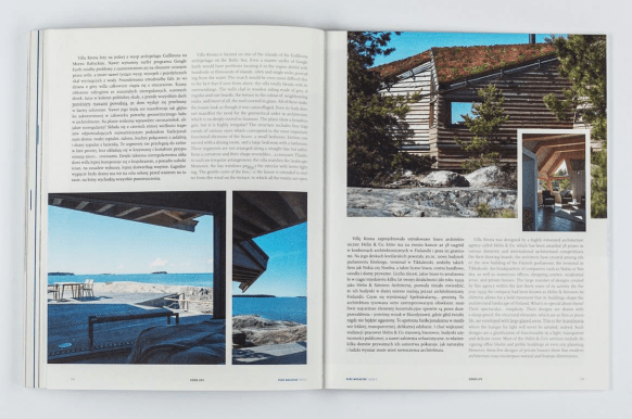
This page of magazine is simple and relaxing.You can see that the editor used repetition because he repeated the image but in a crop form.White space is used in the background of the page.Aside from it,the editor made the magazine a simple for the images to be emphasized and there are text to give some description to the images shown in the magazine.Over all,this is a good visual design.
4.Poster
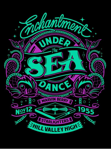
This poster is creative at unique.The owner of the poster used contrast as he lighten the font and design in a heavy black background.Proximity is applied in the poster because of the arrangement of the text.Form its tittle to supporting details.You will also see that there is emphasis used in the poster because the size of the font of the main topic of the event.Over all this is a good visual design.
5.Flyer
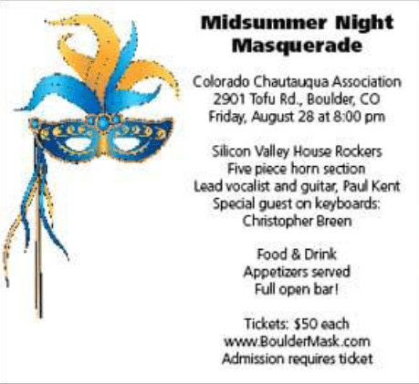
This flyer is simple yet detailed. White space is used in the flyer as the main background of it.Proximity is used because the text and the arrangement of the details are in one unit.Alignment is also used in this flyer because the masquerade image is blending or connected with the given information in the right side of the flyer.Over all this is a good visual design.
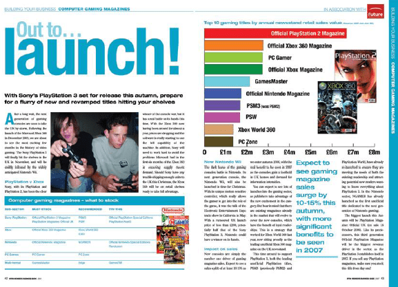
6. Editorial Newspaper
This editorial news paper is simple but you can see its emphasis.White space is widely used a primary background of the page.Proximity is also present as the given information in the first page is in ordered form.You will notice that alignment is used in most of the images because the images and text given in the pages are performing unity.Over all this is a good visual design.
7.Magazine Layout
This magazine layout is a bit too much but you will the details are really impressive.Once again,White space is used as their primary background.This could be a good magazine layout if proper alignment is applied in the page.Emphasis is used in the font of the main topic of the page.But there is no proportion in the images so,over all this is not a good visual design.
8.Poster
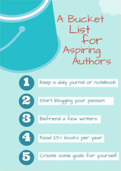
This poster is simple but unique.You can see that the background of the image is colored but it doesn’t destroy the main idea of the poster.Proximity is used because of the numbering of the list inside the poster.Alignment is somehow used as the picture of bucket connects with the list given.Over all this is a good visual design.
♥ ♥ ♥